Friday, March 3rd 2017
Brief Thoughts on Overcast 3
I love podcasts. I have also been a big fan of Overcast since the 1.0 release. It's simple, straightforward, well-designed1 and, to be honest, I really appreciate Marco's ideals and transparency.
The way Marco writes about his design goals and how he worked toward accomplishing them is great. Emphasis mine.
Update the style from iOS 7 to today: More affordances, more curves, thicker fonts, less translucency, more tactility. App-design fashion doesn’t stand still, and many iOS 7-era designs now look dated.
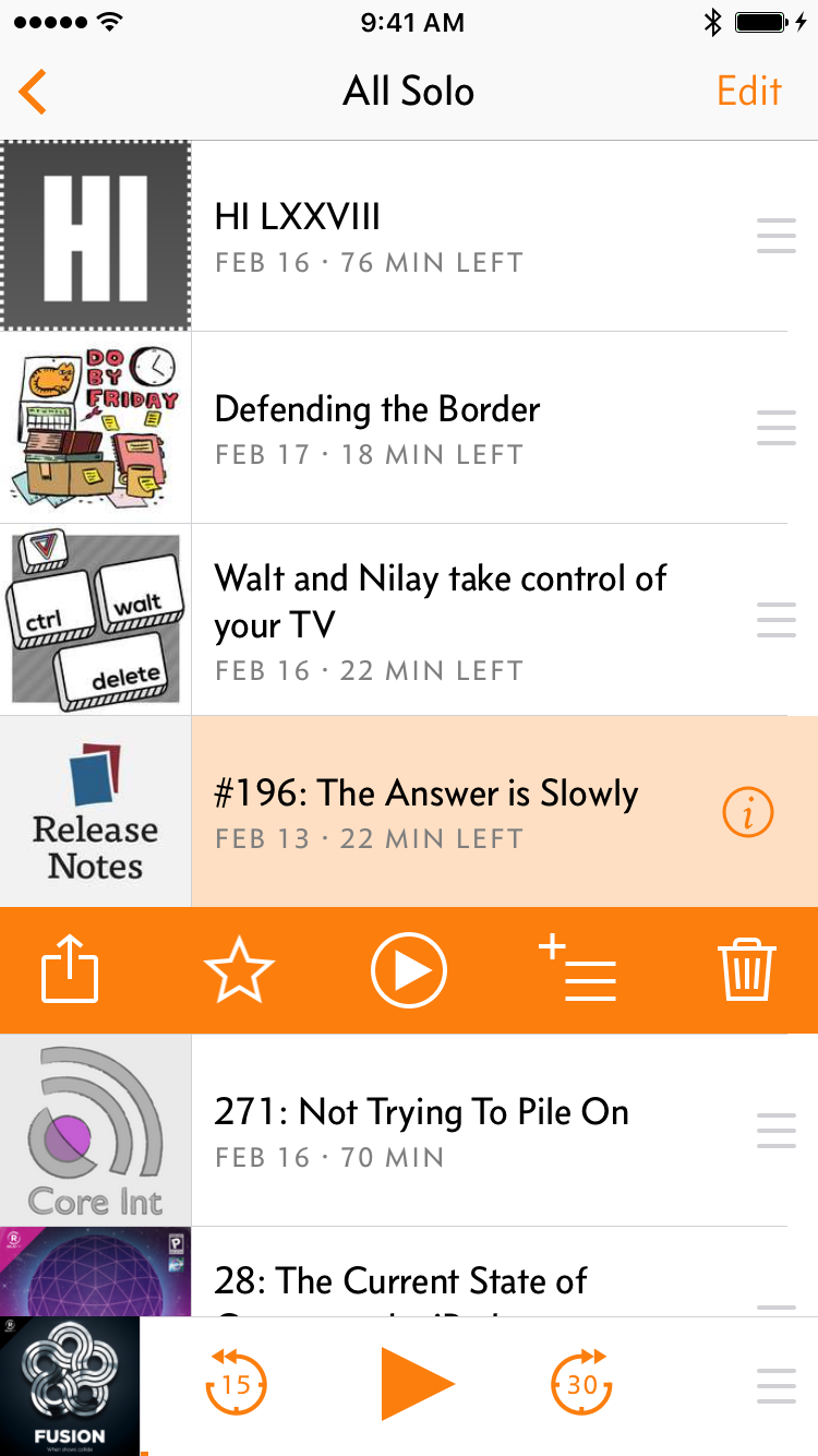
Bring all functionality into the open: Add visible controls and affordances to anything that was previously hard to find or behind a hidden gesture, such as table-cell swipe actions and actions that first require tapping corner “Edit” buttons.
You wouldn’t believe how many customers have asked me to add features that were already there, or couldn’t find basic functions like deleting episodes, because they weren’t apparent enough in the design.
Adapt to larger phones: Enlarge touch targets and make one-handed use faster and easier, even when only part of the screen is within easy reach. I also wanted to reduce the potential for (and effects of) mis-tapping, especially around the lower left and right screen edges, which I believe will become increasingly important as future iPhones presumably get thinner side bezels.
Overcast 1.0 was designed for the iPhone 5S. Some fundamentals needed to be revisited now that the vast majority of my customers are on 4.7- and 5.5-inch screens.
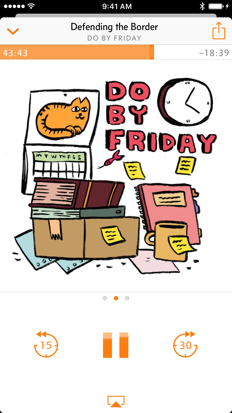
Also of note, Overcast 3 has been updated to use a card/modal metaphor instead of the traditional UINavigationControler push/pop paradigm. I went through a bit of a card design phase and it definitely has some issues navigationally, especially when you're more than a few levels deep. However, I think the implementation in Overcast is pretty good. There really aren't a lot of situations, outside of deep browsing in the podcast directory, that you'll ever get terribly far down a navigation path.
The last thing that I want to mention is that Overcast now uses a completely custom advertising network that Marco built. Unhappy with the results or ads from Google Ads, he apparently decided to create his own advertising platform just for Overcast. The neat part about this boils down to relevancy. It's actually pretty nice to get advertisements for podcasts in a podcast app. While I'm a paying subscriber, I've actually turned ads back on (for now) because I'm always looking for new podcasts. And, so far, the podcasts that have been advertised have been pretty relevant or of interest to me. It will be interesting to see if this continues to work as well for both Overcast and its users over time.
If you haven't checked out Overcast before, or you haven't used it in awhile, I highly recommend that you get Overcast 3. I'd also recommend reading what Marco wrote about the 3.0 release.
1: New Oxford American Dictionary "well designed" (adjective) Designed so as to look attractive or to serve its purpose well: a well-designed sports shoe should absorb impact.
Updated on Saturday, Feb. 15th 2020