Thursday, Oct. 29th 2020
Introducing Air Lookout 2

For the last two years, I’ve been working on a massive rewrite of Air Lookout. It finally launched last week.
Learning On The Go
When Voyager was launched in 1977, radio technology at the time wouldn’t have been able to send or receive communications at the distance from Earth that Voyager is today. Fortunately for the Voyager team, advances in radio technology has progressed faster than the speed that Voyager is distancing itself from Earth.
When I originally made Air Lookout 1, it was the second iOS app I made (R.I.P. Block Circle Block, my first app), but I barely understood many of the essential APIs in the iOS SDK. Since Air Lookout launched in 2016, I’ve learned a lot about iOS development. I’ve had to grow a lot to be able to support Air Lookout where it is today. This update is a big step in my ability and confidence to be able to support Air Lookout. With this update, I can continue to support where Air Lookout is heading.

Redesigned To Feel Like iOS
When I made Air Lookout 1, I didn’t know more than the basics of Swift and the iOS SDK. Everything was built with UIViews, UIButtons and UIImageViews. I even made a custom navigation controller and tab controller because I didn’t understand how to reliably use UINavigationController or UITabController.
By comparison, Air Lookout 2 covers an exhaustive amount of APIs in the iOS, iPadOS, watchOS (and soon macOS Catalyst) SDKs. Because of my previous inability to utilize the library of iOS APIs, Air Lookout never felt like a true iOS app. I grew to hate this. I decided that Air Lookout, in order to feel and work how I wanted for users, I’d have to learn to use a larger amount of the SDK provided by Apple.
It took a lot of learning and mistakes with many frustrating nights and weekends over more than two years, but Air Lookout 2 is finally here designed with functionality and features that I want (and more to come).
New in 2.0
There’s a lot of new features in Air Lookout 2. Here’s a few of my favorites.

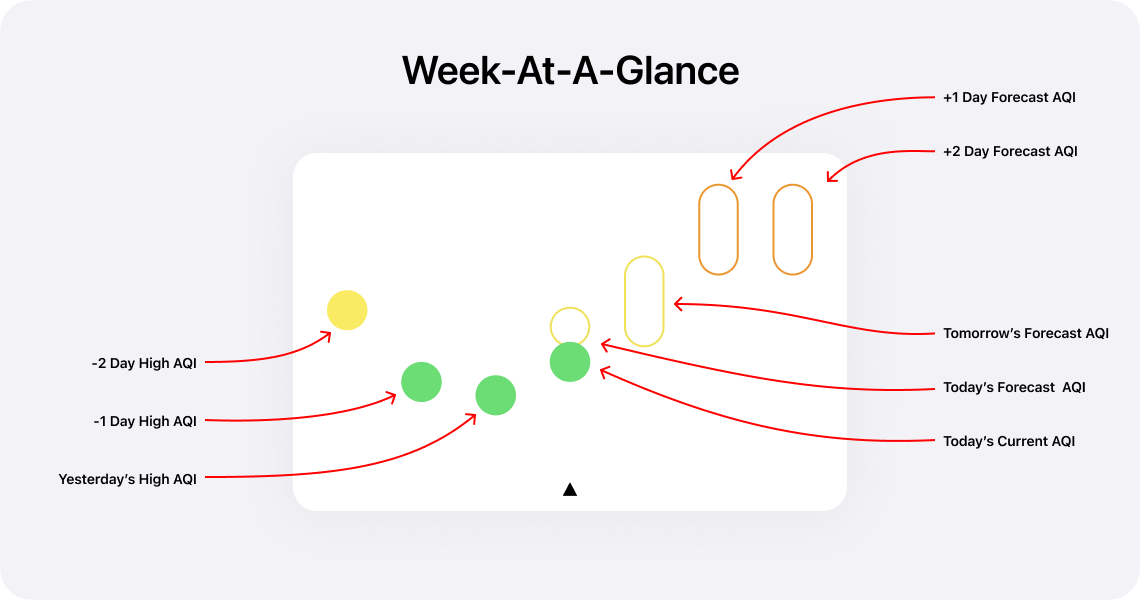
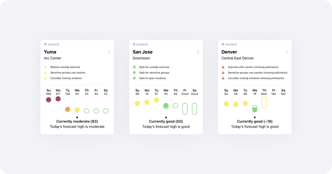
Qualitative Meets Quantitative With Week-At-A-Glance
One of the hardest aspects regarding air quality is that the quantitative numbers—e.g. Moderate (55), Unhealthy For Sensitive Groups (115)—it’s hard to have a reaction based on experience. While the Air Quality Index categories help, seeing context of previous days will aid users in understanding the common questions: “Is today’s air quality better or worse than yesterday?” and “Is the air quality improving or worsening?”
Week-at-a-glance works by showing today’s AQI in comparison with the past three recorded AQI highs and the forecast AQIs (where available). Additionally, week-at-a-glance overlays the current air quality reading with the forecast for today. When an exact forecast AQI is not given, week-at-a-glance will show the expected air quality index range.

While there is a slight learning curve, once you’re used to reading week-at-a-glance, the higher information density is quick to parse.
Your Favorite Locations Without Location Sharing
Feedback that I would regularly receive with earlier versions of Air Lookout was that people didn’t want to share their location. I think that’s a fair complaint (it’s worth mentioning that my Privacy Policy should make it clear that I don't do anything creepy).
Now with Air Lookout 2.0, there’s a number of ways to accomplish this and never have to give Air Lookout location permissions.
The easiest way, that everyone has access to, is to set a home site. This can be accessed under Settings → Home Site.
More importantly, all sites and their data can be accessed by search, which is available at the top of the Stations tab on iOS and at the top of the sidebar on iPadOS.
If someone wishes to keep track of even more sites, one can unlock Air Lookout Pro and save as many sites as they want as a favorite.

Now Available For iPad
For the first time, Air Lookout is available on the iPad. I’m not sure how many people were clamoring for air quality apps on the iPad, but I love using Air Lookout on my iPad Pro.
Air Lookout Pro features, like the detailed hourly chart and map are awesome on the larger iPad screen. Additionally, there’s a sidebar for easy access to the same sections as the iOS tab bar but with shortcuts to view location favorites.
There’s more Air Lookout Pro features that I’m looking forward to that will be exceptional on the iPad.

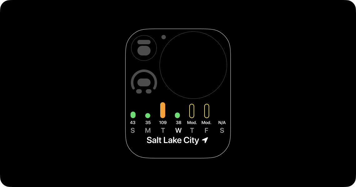
AQI On The Go: Graphic Rectangular Complication
Complications for watchOS have always been a high priority feature for Air Lookout.
When I created week-at-a-glance I wanted to make sure it would work on devices as large as iPads to small graphic rectangular complications. The result for this complication is simplified: a bar chart instead of floating dots and category ranges. This decision was made to increase clarity on small device screens.
When it’s not business hours, where I use the calendar graphic rectangular complication, I switch to a modular compact watch face with this graphic rectangular complication1.
Siri Shortcuts
I had a lot of fun programming Shortcuts. It was hard to resist delaying Air Lookout to create additional Shortcuts (I strangely want to make a Shortcut that changes a smart light to an air quality index category color based on current conditions).
The Shortcuts that ship with Air Lookout should be enough to do a number of basic and useful tasks relating to getting AQI from nearby or favorite stations (App Settings → Shortcuts).
I made a basic shortcut to control my air filter that’s hooked up to a smart outlet that you can download. This can be further automated by using the fantastic Pushcut app.
The Most Important Lesson
After I shipped Air Lookout 1.0, which was originally a $0.99USD paid app, I had an unexpected discovery: my best sales were during the worst wildfires. This caused me to feel unbelievably gross. Profiting off other’s misfortune is the last thing I want Air Lookout to do. As a result, I made Air Lookout 1.x free. No tip jar. No in-app purchase. No profit. I would prefer to run Air Lookout at a loss than profit when people are at risk or in danger.
Not only is air quality an essential human right, but access to air quality data to make daily health and safety decisions should never be behind a pay wall.
Foundation For The Future
The biggest feature in Air Lookout 2.0 is, selfishly, for me2: there’s a new foundation for Air Lookout. To prepare for Air Lookout 2, I removed considerable tech debt that I had accumulated from early and naive decisions. The framework that powers Air Lookout is rewritten and ready for new technologies (such as SwiftUI and Combine) across a variety of devices from watchOS and iOS to macOS and HomePod.
I’m excited about all the upcoming and future features that this foundation will be able to support.
Thank You
There were nearly 50 beta testers that provided essential feedback for Air Lookout 2.0. Without them, the binary and design that shipped would’ve not been nearly as good. More importantly, I need to thank Val for giving me the personal support I needed. When I started working on Air Lookout, Val and I were dating. Now, by the time Air Lookout 2 has shipped, we’ve been married for over 2 years. That’s pretty neat!
Thanks for reading this whole post.
Do you want to support my work? Then download Air Lookout on the App Store and consider upgrading to Air Lookout Pro. You can learn more at airlookout.com.
If you have any feedback or questions, contact me on twitter. I would recommend following @airlookout on twitter for future update information.
Updated on Wednesday, March 13th 2024