Monday, Oct. 25th 2021
I was lucky to be able to get a 14" M1 Max configuration on launch day at my local Apple store. I posted a few observations to a Twitter thread. If you have any questions I might be able to answer, please ask me there!
Assorted Reviews
Jason Snell
The new 14- and 16-inch MacBook Pro models usher in a new era in Apple laptops. These are the first high-end Macs to be powered by Apple-designed processors, and that’s a big deal—but they also reject the minimalist design mid-2010s Apple, which achieved design simplicity by forcing complexity and frustration on users.
…
Clearly, during the last decade there’s been a lot of debate within Apple about this issue. At some point, the idea that somehow aesthetics were more important than utility won the day. Or, if I’m being charitable, people with an overly optimistic view of the future (and of Apple’s power to force that future into being) were given the opportunity to implement their vision.
…
It’s not cheap. No, it’s not. But that’s okay. In fact, even that fact follows from one of the most important lessons Apple has learned in the last five years: The MacBook Pro is a tool for professional users, and it needs to be built with their needs in mind.
If you only read one of these reviews, Jason Snell's post at SixColors.com should be the one you read. He perfectly captures the about-face and optimism around Apple's responsiveness that I know many are feeling right now.
Stu Maschwitz
Apple opened their October event with a young musician creating an Apple-inspired music track in a dingy garage filled with gear worth tens of thousands of dollars. Some viewers commented on the unrealistic portrayal of a creative professional. But I felt like I was looking in a mirror.
…
That uncharacteristic willingness to admit that a grand experiment did not pay out is perhaps the single most dominating vibe of these computers. Apple is not known for graciously admitting a mistake, yet here we have laptops that have so resoundingly repudiate their design assertions of the last half-decade that it’s hard for us pros to not feel at least seen, if not downright vindicated.
…
So my advice is this: Go big or go Air. Either max out your M1 Max, or don’t bother with these machines. These MacBook Pros exist to compete at the very highest end of laptop performance, so don’t buy one that’s not racetrack-ready.
…
Apple is going hard with their in-house processors, and with these pro laptops, I think they are showing their vison for the future: integrated, enclosed, and efficient. Just like the best Macs have always been.
The Verge
It’s easy to be excited about the new MacBook Pros — it feels like Apple finally listened to everyone and brought back the best parts of the beloved 2015 MacBook Pro, while pushing the display and performance to new heights. I know a lot of people who ordered one sight unseen; the pent-up demand for a great pro Mac laptop has been growing since Apple released the MacBook Air and 13-inch MacBook Pro with M1 chips last year.
…
The other major design change is a personal victory: Apple finally got rid of the Touch Bar, which never really lived up to its potential, and replaced it with full-height function keys. They’re great, uncomplicated, and do exactly what you’d expect.
…
And a major reason we’re taking a little extra time to publish our full review is because I want to be really certain about battery life — we loved the battery life we got on the M1 machines last year, but these have much beefier chips, bigger, brighter displays, and get used for more intense tasks, so I want to be as sure about that as we can. The early results are promising — big batteries and efficient chips are a good combination — but we want to push things as hard as we can.
I too am curious about the battery life with the M1 Pro and the M1 Max. I love the "practically forever in usage" battery life of my M1 (without seemingly much performance compromise).
Anandtech
The M1 Pro and M1 Max change the narrative completely – these designs feel like truly SoCs that have been made with power users in mind, with Apple increasing the performance metrics in all vectors. We expected large performance jumps, but we didn’t expect the some of the monstrous increases that the new chips are able to achieve.
…
The chips here aren’t only able to outclass any competitor laptop design, but also competes against the best desktop systems out there, you’d have to bring out server-class hardware to get ahead of the M1 Max – it’s just generally absurd.
…
On the GPU side of things, Apple’s gains are also straightforward. The M1 Pro is essentially 2x the M1, and the M1 Max is 4x the M1 in terms of performance. Games are still in a very weird place for macOS and the ecosystem, maybe it’s a chicken-and-egg situation, maybe gaming is still something of a niche that will take a long time to see make use of the performance the new chips are able to provide in terms of GPU. What’s clearer, is that the new GPU does allow immense leaps in performance for content creation and productivity workloads which rely on GPU acceleration.
…
The combination of raw performance, unique acceleration, as well as sheer power efficiency, is something that you just cannot find in any other platform right now, likely making the new MacBook Pro’s not just the best laptops, but outright the very best devices for the task.
I think they like them.
Austin Mann
My resounding answer is that the upgrade in the M1 MacBook Pros will substantially affect absolutely everyone. The battery life is not just slightly better, it’s on a radically different planet. This machine stays cool and handles whatever you can throw at it, whether that’s making a family photo album in Photos or rendering an animation in After Effects.
…
Turns out, it wasn’t great, and some of the assumptions the 2016 MBP was built on just never panned out. I’m really glad the team at Apple has listened intently to the creative community and been willing to backtrack a bit on the physical interfaces of the machine—while also rocketing into the future with Apple’s new silicon.
…
First, I ran an image stack in Starry Landscape Stacker on 100 TIFF files (150MB each). It took 4m 24s to render and battery life was still at 100% (the fan remained inaudible).
Second, I ran a Cinebench test, which finished in just a few minutes and still the battery was 100%.
Third, I went back the 100 TIFF image files and opened them into StarStax and processed a "Gap Filling" blend of all 100 TIFF files. This intensive process took another 2m 36s and still the battery was at 100%.
So I opened eight images into Adobe Camera Raw and used Photomerge to create a giant panorama. This happened quickly, and you guessed it, the battery life still showed 100%.
At this point I kind of ran out of options, so I went back to Cinebench to run the test again on loop. About 2.5 minutes into that test, the battery life finally dropped down to 99%.
…
For reference, I ran this process on my previous gen 16" MacBook Pro (which has decent battery health of 85%). After completing step three (“Gap Filling” StarStax process), the battery was at 71%. Also, fans spun up to max RPM during step one and never went back down.
…
Apple products at their best are fun to use—elegant, powerful, and functional. With the return of a practical port set and Apple silicon inside, the new MacBook Pro M1 Max strikes a great balance, and I’m sure you will absolutely love this new era of Mac.
I know that battery percentage isn't always reported linearly, but it's still quite impressive.
John Gruber
Perhaps my favorite thing about these new MacBook Pros is that the 14-inch model is spec-for-spec the peer of the 16-inch model. Heretofore, only the larger 15- and 16-inch MacBook Pros got the very fastest chips — particularly hot-running battery-hungry GPUs — among other advantages. So while one way to think about this generation is that they got heavier than the last generation of Intel models (comparing 14-inch to 13-inch, and 16-inch to 16-inch), another way to think about it is that the fastest laptop in the world is now available in a 14-inch footprint and weighs just 3.5 pounds. There’s no compromise on performance — you just pick which size you prefer.
This is weirdly my favorite part about the 14" and 16". I reminds me of the 12" and 15" PowerBook G4 laptops. I used to have a high spec 12" PowerBook G4 and I loved that it was almost the same specs of the larger 15". Except that this is even better!
Speaking of the notch, I’m genuinely curious about the lack of Face ID. Is the display lid too thin for the sensor array? We don’t think of iPhones and iPads as thick, but they’re a lot thicker than a MacBook lid. Does Apple just think Face ID is not a good fit for the Mac? Do they think it would be confusing or inelegant to offer both Face ID and Touch ID, and they simply think Touch ID is the better fit for devices that always have hardware keyboards?
I was really hoping for FaceID.
I think Apple got stuck with misplaced MacBook Pro priorities at an inopportune time: near the cusp of the transition to Apple silicon. Apple does not relish explaining their mistakes. But they do acknowledge them, and make changes to address them. They are confident and proud, but seldom obstinate. The Macintosh platform is 37 years old. Four decades! But this new MacBook Pro is the nicest and best Mac I’ve ever used. If Apple could have built and shipped this sooner, I’m quite certain they would have. But they couldn’t. Only now can they design custom silicon to power the professional-class machines they envisioned, as opposed to designing the hardware around the best silicon available from Intel.
YouTubers:
Related:
Mac Pro (2019) and Pro Display XDR Initial Roundup,
iFixit On The New Macbook Pro Keyboard,
New Macbooks Pro (2018),
Can the MacBook Pro Replace Your iPad?,
Matthew Panzarino on the iMac Pro,
16-inch Macbook Pro (Late 2019) Review Roundup,
Lance Ulanoff on the iMac Pro,
The Verge On The Mac Pro (2019)
Thursday, July 22nd 2021
Playdate Website
It's a new, tiny handheld game system with a bunch of brand-new games. We made Playdate just for fun.
That's not all. We're lining up more games, and we're working on cool ways to distribute them. Stay tuned.
You will also be able to make your own Playdate games, as our SDK – coming soon – will be free to download, no special hardware required. And with our Pulp game maker, all you need is a web browser. And side-loading games directly onto the Playdate is easy.
Battery: 14 days standby clock, 8 hours active
CPU:
180 MHz Cortex M7
SDK supports Lua, C
Storage:
16 MB RAM
32 KB L1Cache
4 GB Flash
Size:
76 × 74 × 9 mm
Included:
Playdate
USB-C to A Cable
User Guide
Wireless:
802.11bgn 2.4GHz Wi-Fi
Bluetooth®
Sound:
Built-In Mono Speaker
Stereo Headphone Jack
Condenser Mic + TRRS Mic In
Display:
400 × 240 1-bit
Inputs:
D-Pad
A + B
Sleep + Menu
3-Axis Accelerometer
Crank
Cost:
$179
Plus Taxes & Shipping
Ars Technica
That bias contributes in some part to my interest in the Playdate, a $179 portable gaming system that errs on the side of childish, low-powered fun. I've spent three weeks testing the system's "near-final" hardware ahead of preorders opening up on 1 pm ET on Thursday, July 29, and I can confirm that it's indeed fun to look at. Luckily, it's also fun, simple, and accessible to hold, play with, and share with every friend that I can.
The Verge
It looks kind of like a Game Boy that comes from an alien world. There are familiar elements, like a D-pad and face buttons, but many of its games are controlled by a crank that slots into the side. And those games are only available in black and white, and they’ll eventually be released as part of weekly mystery drops.
Thursday, Oct. 29th 2020

For the last two years, I’ve been working on a massive rewrite of Air Lookout. It finally launched last week.
Learning On The Go
When Voyager was launched in 1977, radio technology at the time wouldn’t have been able to send or receive communications at the distance from Earth that Voyager is today. Fortunately for the Voyager team, advances in radio technology has progressed faster than the speed that Voyager is distancing itself from Earth.
When I originally made Air Lookout 1, it was the second iOS app I made (R.I.P. Block Circle Block, my first app), but I barely understood many of the essential APIs in the iOS SDK. Since Air Lookout launched in 2016, I’ve learned a lot about iOS development. I’ve had to grow a lot to be able to support Air Lookout where it is today. This update is a big step in my ability and confidence to be able to support Air Lookout. With this update, I can continue to support where Air Lookout is heading.

Redesigned To Feel Like iOS
When I made Air Lookout 1, I didn’t know more than the basics of Swift and the iOS SDK. Everything was built with UIViews, UIButtons and UIImageViews. I even made a custom navigation controller and tab controller because I didn’t understand how to reliably use UINavigationController or UITabController.
By comparison, Air Lookout 2 covers an exhaustive amount of APIs in the iOS, iPadOS, watchOS (and soon macOS Catalyst) SDKs. Because of my previous inability to utilize the library of iOS APIs, Air Lookout never felt like a true iOS app. I grew to hate this. I decided that Air Lookout, in order to feel and work how I wanted for users, I’d have to learn to use a larger amount of the SDK provided by Apple.
It took a lot of learning and mistakes with many frustrating nights and weekends over more than two years, but Air Lookout 2 is finally here designed with functionality and features that I want (and more to come).
New in 2.0
There’s a lot of new features in Air Lookout 2. Here’s a few of my favorites.

Qualitative Meets Quantitative With Week-At-A-Glance
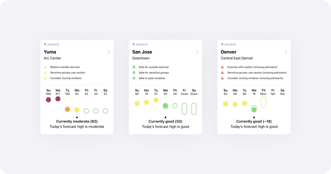
One of the hardest aspects regarding air quality is that the quantitative numbers—e.g. Moderate (55), Unhealthy For Sensitive Groups (115)—it’s hard to have a reaction based on experience. While the Air Quality Index categories help, seeing context of previous days will aid users in understanding the common questions: “Is today’s air quality better or worse than yesterday?” and “Is the air quality improving or worsening?”
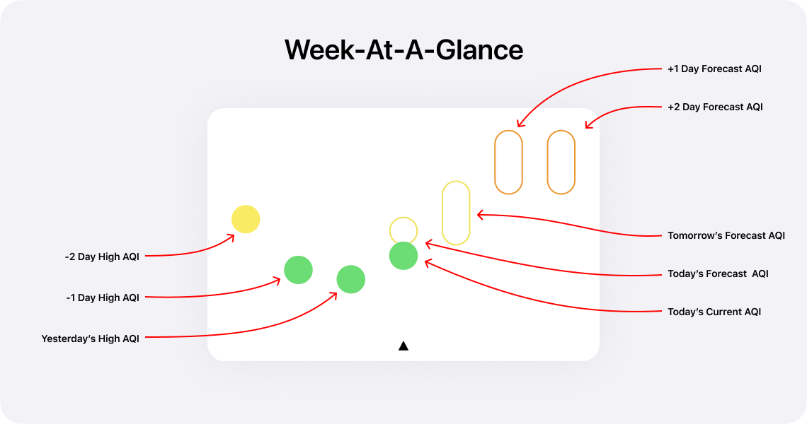
Week-at-a-glance works by showing today’s AQI in comparison with the past three recorded AQI highs and the forecast AQIs (where available). Additionally, week-at-a-glance overlays the current air quality reading with the forecast for today. When an exact forecast AQI is not given, week-at-a-glance will show the expected air quality index range.

While there is a slight learning curve, once you’re used to reading week-at-a-glance, the higher information density is quick to parse.
Your Favorite Locations Without Location Sharing
Feedback that I would regularly receive with earlier versions of Air Lookout was that people didn’t want to share their location. I think that’s a fair complaint (it’s worth mentioning that my Privacy Policy should make it clear that I don't do anything creepy).
Now with Air Lookout 2.0, there’s a number of ways to accomplish this and never have to give Air Lookout location permissions.
The easiest way, that everyone has access to, is to set a home site. This can be accessed under Settings → Home Site.
More importantly, all sites and their data can be accessed by search, which is available at the top of the Stations tab on iOS and at the top of the sidebar on iPadOS.
If someone wishes to keep track of even more sites, one can unlock Air Lookout Pro and save as many sites as they want as a favorite.

Now Available For iPad
For the first time, Air Lookout is available on the iPad. I’m not sure how many people were clamoring for air quality apps on the iPad, but I love using Air Lookout on my iPad Pro.
Air Lookout Pro features, like the detailed hourly chart and map are awesome on the larger iPad screen. Additionally, there’s a sidebar for easy access to the same sections as the iOS tab bar but with shortcuts to view location favorites.
There’s more Air Lookout Pro features that I’m looking forward to that will be exceptional on the iPad.

AQI On The Go: Graphic Rectangular Complication
Complications for watchOS have always been a high priority feature for Air Lookout.
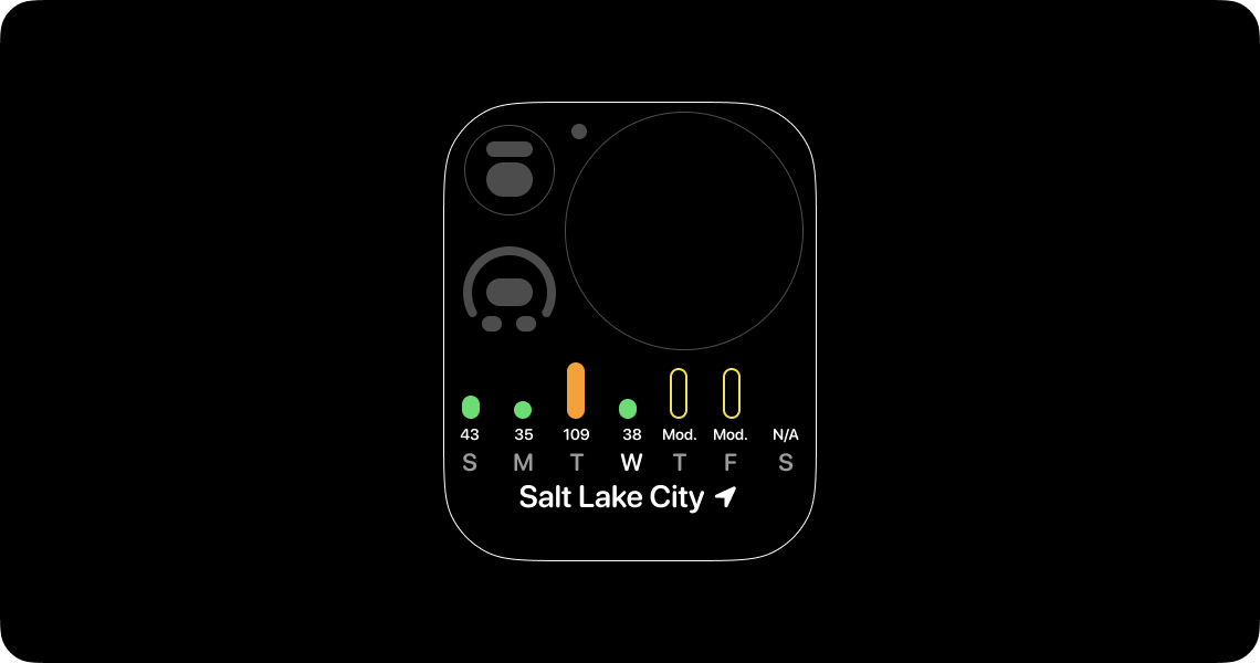
When I created week-at-a-glance I wanted to make sure it would work on devices as large as iPads to small graphic rectangular complications. The result for this complication is simplified: a bar chart instead of floating dots and category ranges. This decision was made to increase clarity on small device screens.
When it’s not business hours, where I use the calendar graphic rectangular complication, I switch to a modular compact watch face with this graphic rectangular complication1.
Siri Shortcuts
I had a lot of fun programming Shortcuts. It was hard to resist delaying Air Lookout to create additional Shortcuts (I strangely want to make a Shortcut that changes a smart light to an air quality index category color based on current conditions).
The Shortcuts that ship with Air Lookout should be enough to do a number of basic and useful tasks relating to getting AQI from nearby or favorite stations (App Settings → Shortcuts).
I made a basic shortcut to control my air filter that’s hooked up to a smart outlet that you can download. This can be further automated by using the fantastic Pushcut app.
The Most Important Lesson
After I shipped Air Lookout 1.0, which was originally a $0.99USD paid app, I had an unexpected discovery: my best sales were during the worst wildfires. This caused me to feel unbelievably gross. Profiting off other’s misfortune is the last thing I want Air Lookout to do. As a result, I made Air Lookout 1.x free. No tip jar. No in-app purchase. No profit. I would prefer to run Air Lookout at a loss than profit when people are at risk or in danger.
Not only is air quality an essential human right, but access to air quality data to make daily health and safety decisions should never be behind a pay wall.
Foundation For The Future
The biggest feature in Air Lookout 2.0 is, selfishly, for me2: there’s a new foundation for Air Lookout. To prepare for Air Lookout 2, I removed considerable tech debt that I had accumulated from early and naive decisions. The framework that powers Air Lookout is rewritten and ready for new technologies (such as SwiftUI and Combine) across a variety of devices from watchOS and iOS to macOS and HomePod.
I’m excited about all the upcoming and future features that this foundation will be able to support.
Thank You
There were nearly 50 beta testers that provided essential feedback for Air Lookout 2.0. Without them, the binary and design that shipped would’ve not been nearly as good. More importantly, I need to thank Val for giving me the personal support I needed. When I started working on Air Lookout, Val and I were dating. Now, by the time Air Lookout 2 has shipped, we’ve been married for over 2 years. That’s pretty neat!
Thanks for reading this whole post.
Do you want to support my work? Then download Air Lookout on the App Store and consider upgrading to Air Lookout Pro. You can learn more at airlookout.com.
If you have any feedback or questions, contact me on twitter. I would recommend following @airlookout on twitter for future update information.
Related:
Air Lookout 1.4: All The Complications,
Medium: Designing Air Lookout
Friday, April 24th 2020
Many Apple developers and rumor followers have been expecting or hoping for ARM based macs in the near future. The performance of the A12 and A13 powered iPhone and iPad has surpassed the performance of their Intel powered mac laptops and desktops in certain areas.
The Verge: Apple will reportedly use 12-core 5nm ARM processor in a 2021 Mac:
Apple will release its first Mac powered by an ARM processor in 2021, Bloomberg reports. The company is thought to have three Mac processors in development as part of its Kalamata project, which are all based on the A14 chip that’s due to be used in this year’s flagship iPhone lineup. According to Bloomberg, the first of these processors will include a 12-core CPU with eight high-performance “Firestorm” cores and at least four energy-efficient “Icestorm” cores.
Bloomberg’s report offers a lot of technical details on the form Apple’s chips could take:
- Three Mac System-on-Chip (SoC) designs based on the A14 processor are currently in development, and work has also started on a Mac SoC based on next year’s iPhone processor. Bloomberg speculates that Apple is planning to keep both its laptop and mobile chips on the same development cycle.
- The Mac chips will reportedly be manufactured by TSMC based on a 5nm fabrication process.
- The first of these chips will feature eight high-performance CPU cores and at least four energy-efficient cores, for 12 cores in total. The A12Z chip used in the current iPad Pro has eight cores: four high performance and four energy efficient.
- As well as a CPU, the SoC will also include a GPU.
- ARM Mac computers will continue to run macOS rather than switching to iOS, similar to the approach taken with existing Windows laptops that use Qualcomm ARM processors.
- Bloomberg speculates that Apple’s first ARM-based machines will be lower-powered MacBooks because its own chips won’t be able to match Intel’s performance in its higher-end MacBook Pros, iMacs, and Mac Pro computers.
- Back in 2018, Apple reportedly developed a prototype Mac chip based on that year’s iPad Pro A12X processor. The success of this prototype is thought to have given the company the confidence to target a transition as early as 2020.
mjtsai: ARM Macs in 2021:
I expect the ARM transition to be accompanied by removal of lots of APIs, so developers will have to contend with that, as well as porting and testing their own code, and dealing with any dependencies that have broken.
While everyone has mostly been focused on the first machine a lower powered ARM mac could be (likely the MacBook), they are quick to say that Apple’s ARM chips couldn’t compete with the high-end Intel mac laptops or Intels Xeons in the iMac Pro and Mac Pro. This has left me wondering what a high-powered workstation class macOS ARM processor could be like.
While I do have a travel laptop, almost all of my work is done on a 2015 iMac1. This has left me to wonder what a workstation class ARM-based mac would be like and how long it might be until it’s available.
Fortunately, some ARM powered workstations and servers2 already exist for comparison.
AnandTech: Arm Development For The Office: Unboxing an Ampere eMag Workstation
Inside the system is a 32-core Ampere eMag server, with 256 GB of eight-channel DDR-2666 memory, a 500GB WD Black SN750 NVMe SSD, a 960 GB Micron 5300 Pro SATA SSD in the rear, a Corsair VS 650W power supply, and an AMD Radeon Pro WX 5100 graphics accelerator…
The eMAG 8180 is a 32-core design running at 2.8 GHz with a turbo up to 3.3 GHz, with a TDP of 125 W. This is a first generation eMAG, which uses the old AppliedMicro Skylark microarchitecture, a custom design of Arm v8 with 32 MB of L3, 42 PCIe lanes, and eight memory channels. Avantek offers the system with three optional graphics cards: AMD FirePro W2100, a Radeon Pro WX 5100, and the NVIDIA Quadro GV100.
I am really curious to see how this CPU benchmarks against some similar wattage Xeons. This seems really promising for a design and development workstation.
This Ampere eMag Workstation can be configured on their website and starts at $3,938. A setup like this could be comfortably within the Mac Pro price range.
AnandTech: Next Generation Arm Server: Ampere’s Altra 80-core N1 SoC for Hyperscalers against Rome and Xeon:
On top of the 80 cores, the SoC will also have eight DDR4-3200 memory channels with ECC support, up to 4 TB per socket. There are also 128 PCIe 4.0 lanes, with which the CPU can use 32 of them to hook up to another CPU for dual socket operation. The dual socket system can then have a total of 192 PCIe 4.0 lanes between it, as well as support for up to 8 TB of memory. We are told that it’s actually the CCIX protocol that runs over these PCIe lanes, which means 25 GB/s per x16 linkup. That’s good for 50 GB/s in each direction.
Each of the 80 cores is designed to run at 3.0 GHz all-core, and Ampere was consistent in its messaging in that the top SKU is designed to run at 3.0 GHz at all times, even when both 128-bit SIMD units per core are being used (thus an unlimited turbo at 3.0 GHz). The CPU range will vary from 45W to 210W, and vary in core count - we suspect these SKUs will be derived from the single silicon design, and it will depend on demand as well as binning as to what comes out of the fabs.
This definitely sounds promising. 3GHz x 80 cores would be amazing. The 45W TDP of the lower spec CPUs (barely) matches the 16” MacBook Pro TDP which is also 45W. The high end 210W spec is also very close to the 2019 Mac Pro Xeon W TDP of 205W.
While I have no idea what an Apple designed workstation CPU would be like, it should be noted that both of the above examples from Ampere are being built on TSMC’s 5nm process which is the fab and production company that Apple is also going to be using.
A Brief Note on Software: Unfortunately, a lot of design tools are still single-core or barely multi-core capable. Design tools aren’t ready for this massively parallel future… yet.
I hope that once more 64 core (and more!) CPUs become standard in design workstations it will motivate software to take advantage of more parallel computing.
1: The last two generations of iPhone have a faster single core speed than my iMac. The iPhone 11 even has a 30% faster single core benchmark. Regarding multi-core, the 2018 iPad Pro is 9% faster than my iMac.
2: ARM powered servers have been making some big gains for their great performance per watt. I wonder if there’s a small possibility of an ARM-based Xserve returning. At least, I can dream about it.
Related:
Inside Apple's perfectionism machine,
Mac Pro Design,
The Verge on the iPad Pro,
Regarding The iPad Pro 3rd Generation,
Apple Updates HIG To Include Pointers On iPadOS


